Navigation component Introduction made using single activity UI pattern easy. Although it introduces a stranded way to follow a single activity UI design pattern it comes with its own challenges to overcome. One of which is to have a seamless transition between coordinator design fragment and other fragments.
The issue with using coordinator layout design with Navigation Component
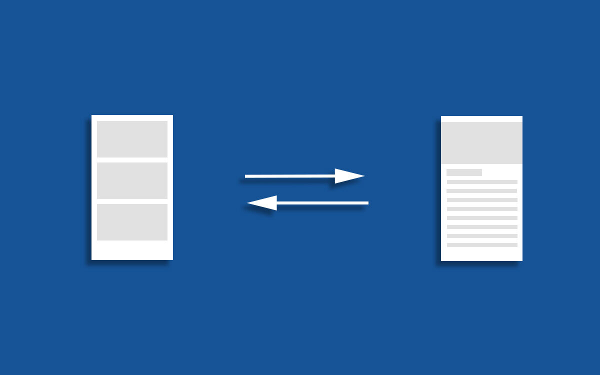
When implementing the navigation component activity act as a navigation fragment holder. Fragments in the navigation component consume the data coming from the view model and display for users to interact with users. Activity holds navigation fragments and toolbar. The app toolbar is placed inside activity because it’s common for most of the fragments. This works fine as long as there is no need to implement a design involving coordinator layout. Coordinator layout does those beautiful collapsing animation by using CollapsingToolbarLayout inside AppBarLayout. The app toolbar also needed to stay inside CollapsingToolbarLayout.
So this to work there should be a way to send the data from the view model to the activity after it is received to the fragment. This is obviously possible but until this point activity didn’t have the responsibility of handling data. This way the code separation going to break.
Solution
The easiest solution is to have an activity for this design. Although it is possible to use activity in the navigation component you can’t have a navigation path from that activity to another fragment. So this way you unnecessarily break the navigation graph.
The solution I came up with does not require to send data from fragment to activity and it’s implemented using fragments only. I’m using motion layout to get the gesture-based animation which replicates collapsing animation in CoordinatorLayout. To have a seamless transition between the fragments I’m using value animation.
Our Example
Our example emulates a common use case for CoordinatorLayout implementation. It’s navigating from a list of content to show the details of that selected item. The view with the recycler view has a visible toolbar when it navigates to the detail view full-screen detail view of that selected item is displayed. on swap up of that view, we have classic CoordinatorLayout collapsing animation.
Introduction to Motion Layout
I’m not going to explain the motion layout in-depth here because it would make this article too long plus we are not using its full potential to implement this example. Basically, MotionLayout is a subclass of ConstraintLayout which allows developers to design UI the same way as we are used to doing in ConstraintLayout with having the ability to do an animation based on user interaction. You can apply the animation to any number of views inside MotionLayout as long as its direct children of that layout. This is the motion layout design for the UI.
<androidx.constraintlayout.motion.widget.MotionLayout
    xmlns:android="http://schemas.android.com/apk/res/android"
    xmlns:app="http://schemas.android.com/apk/res-auto"
    xmlns:tools="http://schemas.android.com/tools"
    android:layout_width="match_parent"
    android:layout_height="match_parent"
    android:background="@android:color/white"
    app:layoutDescription="@xml/fragment_detail_scene">

    <com.google.android.material.floatingactionbutton.FloatingActionButton
        android:id="@+id/floatingFavoriteButton"
        android:layout_width="wrap_content"
        android:layout_height="wrap_content"
        android:layout_gravity="bottom|right"
        android:layout_margin="16dp"
        app:fabSize="mini"
        app:srcCompat="@drawable/ic_favorite_border"
        app:layout_constraintTop_toTopOf="@id/scrollView"
        app:layout_constraintBottom_toTopOf="@id/scrollView"
        app:layout_constraintEnd_toEndOf="parent"/>

    <FrameLayout
        android:id="@+id/statusBraView"
        android:layout_width="match_parent"
        android:layout_height="24dp"
        android:background="@color/colorPrimaryDark"
        app:layout_constraintEnd_toEndOf="parent"
        app:layout_constraintStart_toStartOf="parent"
        app:layout_constraintTop_toTopOf="parent" />

    <FrameLayout
        android:id="@+id/appBarView"
        android:layout_width="match_parent"
        android:layout_height="276dp"
        android:background="@color/colorPrimary"
        app:layout_constraintEnd_toEndOf="parent"
        app:layout_constraintStart_toStartOf="parent"
        app:layout_constraintTop_toBottomOf="@id/statusBraView" />

    <ImageView
        android:id="@+id/mainImageView"
        android:layout_width="match_parent"
        android:layout_height="300dp"
        android:scaleType="centerCrop"
        app:layout_constraintEnd_toEndOf="parent"
        app:layout_constraintStart_toStartOf="parent"
        app:layout_constraintTop_toTopOf="parent"
        app:srcCompat="@drawable/geralt_of_rivia" />

    <ImageView
        android:id="@+id/backButton"
        android:layout_width="24dp"
        android:layout_height="24dp"
        android:layout_marginStart="16dp"
        android:layout_marginTop="40dp"
        android:src="@drawable/ic_arrow_back"
        app:layout_constraintStart_toStartOf="parent"
        app:layout_constraintTop_toTopOf="parent" />

    <ImageView
        android:id="@+id/menuFavoriteButton"
        android:layout_width="24dp"
        android:layout_height="24dp"
        app:layout_constraintEnd_toEndOf="parent"
        app:layout_constraintTop_toTopOf="parent"
        android:layout_marginTop="40dp"
        android:layout_marginEnd="16dp"
        app:srcCompat="@drawable/ic_favorite_border"
        android:alpha="0"/>

    <TextView
        android:id="@+id/title"
        android:layout_width="0dp"
        android:layout_height="wrap_content"
        android:layout_marginStart="16dp"
        android:layout_marginBottom="16dp"
        android:fontFamily="@font/product_sans_regular"
        android:text="Geralt of Rivia"
        android:textColor="@android:color/white"
        android:textSize="26sp"
        app:layout_constraintBottom_toBottomOf="@+id/mainImageView"
        app:layout_constraintStart_toStartOf="parent" />

    <androidx.core.widget.NestedScrollView
        android:id="@+id/scrollView"
        android:layout_width="match_parent"
        android:layout_height="0dp"
        android:visibility="visible"
        app:layout_constraintBottom_toBottomOf="parent"
        app:layout_constraintEnd_toEndOf="parent"
        app:layout_constraintStart_toStartOf="parent"
        app:layout_constraintTop_toBottomOf="@id/appBarView">

        <LinearLayout
            android:id="@+id/scrollContainer"
            android:layout_width="match_parent"
            android:layout_height="wrap_content"
            android:background="@android:color/white"
            android:orientation="vertical">

            <TextView
                android:id="@+id/descriptionTextView"
                android:layout_width="wrap_content"
                android:layout_height="wrap_content"
                android:fontFamily="@font/product_sans_regular"
                android:padding="16dp"
                android:text="@string/geralt_description"
                android:textColor="@color/textColorSecondary"
                app:lineHeight="20dp" />

        </LinearLayout>

    </androidx.core.widget.NestedScrollView>

    <androidx.constraintlayout.widget.Guideline
        android:id="@+id/guideline"
        android:layout_width="wrap_content"
        android:layout_height="wrap_content"
        android:orientation="vertical"
        app:layout_constraintGuide_begin="75dp" />

</androidx.constraintlayout.motion.widget.MotionLayout>
As you can see there are two views named “statusBraView” and “appBarView”. These views are used to create an identical default status bar and toolbar. My approach is to hide the toolbar in the activity view which I commonly use for all the fragments when users navigate to this view make the activity full screen. This way the “mainImageView” will appear under the status bar. When users scroll the detail view the image view will fade out and “statusBraView” and “appBarView” will create an identical view to the default toolbar and status bar.
I have set a few fixed value heights for some views. The Image view we are using here is 300dp height and width to fit its parent. “statusBraView” and “appBarView” dimensions are decided according to the guide in material.io. “statusBraView” with the height of 24dp with “colorPrimaryDark” set as the background color to match default status bar design. “appBarView” with the background color set to “colorPrimary” to look like the toolbar. Its height is set to 276dp which I got from deducting status bar height from “mainImageView” height. The”backButton” image view represents the back button in the general toolbar. we have a fab button in the view to make this detail view a favorite. That view will disappear as the user scroll up and display as a toolbar icon which represented my “menuFavoriteButton”. And finally, we have the title text view which acts as a toolbar title.
So let’s get into animation. I’m going to explain how to do it in the code because still android studio built-in UI editor for motion editor not working correctly. When they fix small bugs in that UI editor developers will be able to implement motion layout animation like using a video editor tool. MotionLayout animation is defined in a XML file that needs to place in res/xml folder. so you have to pass that to “layoutDescription” in MotionLayout.
First, we need to decide on what guesser we need to move NestedScrollView. So what first need to achieve when user swap upon NestedScrollView move it till it has the space to showcase the toolbar. So define that animation like below in xml file. Basically what happens is “scrollView” top constraint going to change from “appBarView” to parent. That 80dp top merging is calculated by adding toolbar and status bar height according to material.io guideline (24dp +56dp)
<Transition
        motion:constraintSetEnd="@+id/end"
        motion:constraintSetStart="@id/start"
        motion:duration="1000">
        <OnSwipe
            motion:dragDirection="dragUp"
            motion:touchAnchorId="@+id/scrollView" />
    </Transition>

    <ConstraintSet android:id="@+id/start">
        <Constraint
            android:id="@+id/scrollView"
            android:layout_width="match_parent"
            android:layout_height="0dp"
            motion:layout_constraintBottom_toBottomOf="parent"
            motion:layout_constraintEnd_toEndOf="parent"
            motion:layout_constraintStart_toStartOf="parent"
            motion:layout_constraintTop_toBottomOf="@id/appBarView" />
    </ConstraintSet>

    <ConstraintSet android:id="@+id/end">
        <Constraint
            android:id="@+id/scrollView"
            android:layout_width="match_parent"
            android:layout_height="0dp"
            android:layout_marginTop="80dp"
            motion:layout_constraintBottom_toBottomOf="parent"
            motion:layout_constraintEnd_toEndOf="parent"
            motion:layout_constraintStart_toStartOf="parent"
            motion:layout_constraintTop_toTopOf="parent" />
    </ConstraintSet>
</MotionScene>
The next step is to fade out the “mainImageView” so that “statusBraView” and “appBarView” can be fade in. We need to animate the alpha of that view as the user scroll up. And to add that parallax effect change the image view height from 300dp to 200dp as it fades out. so define the start and finish like below.
<!-- Strat -->
<Constraint
		android:id="@id/mainImageView"
	  android:layout_width="match_parent"
	  android:layout_height="300dp"
	  android:alpha="1"
	  motion:layout_constraintEnd_toEndOf="parent"
	  motion:layout_constraintStart_toStartOf="parent"
	  motion:layout_constraintTop_toTopOf="parent" />

<!-- End -->
<Constraint
		 android:id="@id/mainImageView"
	   android:layout_width="match_parent"
	   android:layout_height="200dp"
	   android:alpha="0"
	   motion:layout_constraintEnd_toEndOf="parent"
	   motion:layout_constraintStart_toStartOf="parent"
	   motion:layout_constraintTop_toTopOf="parent" />
Next, we need to animate the title as it gets animate from the app bar title to the toolbar title. What needs to achieve is to place the title next to “backButton” with a 32dp start margin according to material.io guideline. but the problem is there is no option to change the text size in MotionLayout. In order to get the correct look, I have placed a vertical Guideline in layout with a 75dp margin to parent start. That 75dp is calculated base on material.io guideline. To achieve the same look I scale down and match the margin start to align the defined Guideline.
<!-- Strat -->
<Constraint
		 android:id="@+id/title"
	   android:layout_width="0dp"
		 android:layout_height="wrap_content"
	   android:layout_marginStart="16dp"
	   android:layout_marginLeft="16dp"
	   android:layout_marginBottom="12dp"
	   android:scaleX="1"
	   android:scaleY="1"
	   motion:layout_constraintBottom_toTopOf="@+id/scrollView"
		 motion:layout_constraintStart_toStartOf="parent" />

<!-- End -->
<Constraint
		 android:id="@+id/title"
	   android:layout_width="0dp"
	   android:layout_height="wrap_content"
	   android:layout_marginStart="26dp"
	   android:layout_marginTop="40dp"
	   android:layout_marginBottom="16dp"
	   android:scaleX="0.75"
	   android:scaleY="0.75"
	   motion:layout_constraintBottom_toTopOf="@+id/scrollView"
	   motion:layout_constraintEnd_toEndOf="parent"
	   motion:layout_constraintStart_toStartOf="parent"
	   motion:layout_constraintTop_toTopOf="parent" />
Now what remaining is to animate the fab button. The fab button needs to be fade out as user swap up and appear as a toolbar icon. Not just like other animations we defined here we need to have these two views static for a period of time without any animation. In order to achieve this, I used KeyFrameSet which allows you to set keyframes during the animation and set value. So “floatingFavoriteButton” should start to fade out when 30% of swap up animation completed and should completely disappear by the time 70% of swap up animation and stay the same way. The image view that acts as a toolbar icon should have the same animation but reverse.
<!-- Transition -->
<KeyFrameSet >
		<KeyAttribute
	      motion:motionTarget="@id/floatingFavoriteButton"
        motion:framePosition="30"
        android:alpha="1"/>
     <KeyAttribute
         motion:motionTarget="@id/floatingFavoriteButton"
         motion:framePosition="70"
         android:alpha="0"/>
     <KeyAttribute
         motion:motionTarget="@id/floatingFavoriteButton"
         motion:framePosition="100"
         android:alpha="0" />
     <KeyAttribute
          motion:motionTarget="@+id/menuFavoriteButton"
          motion:framePosition="0"
          android:alpha="0" />
     <KeyAttribute
          motion:motionTarget="@+id/menuFavoriteButton"
          motion:framePosition="70"
          android:alpha="0" />
      <KeyAttribute
          motion:motionTarget="@+id/menuFavoriteButton"
          motion:framePosition="100"
          android:alpha="1" />
</KeyFrameSet>
Next, we have to take care of the toolbar in the activity. we need to place it off the screen when the fragment transition happens. The first toolbar and navigation fragment holder fragment need to animate along the y-axis to place it off the screen. When this animation completed there will be extra space remaining under the activity because we moved the toolbar and navigation fragment holder. To extend navigation fragment holder height to fill the view I’m using value animator. This value animator animation is applied inside addOnGlobalLayoutListener on “hostFragment” because we need to get the height of the view. Doing it without it will return view height as 0. when that animation is completed I’m making this activity to full-screen mode by changing systemUiVisibility. I couldn’t find a way to make the activity full screen with animation but this will place fragment container underneath the status bar which gives the classic CoordinatorLayout look.
val toolbarHeightToFloat = 147f
val statusBarHeightToFloat = 63f

fun fullScreenTransition() {

   toolbar.animate().translationY(-abs(toolbarHeightToFloat))
        .setDuration(1000).start()
   hostFragment.view?.animate()?.translationY(-abs(toolbarHeightToFloat))?
        .setDuration(1000)?.start()

   hostFragment.view?.viewTreeObserver?.addOnGlobalLayoutListener(object :
      OnGlobalLayoutListener {
	      override fun onGlobalLayout() {

          hostFragment.view?.viewTreeObserver?.removeOnGlobalLayoutListener(this)
          val currentHeight = hostFragment.view?.height

          if (currentHeight != null) {

          val totalFinishValueAnimation =
                   currentHeight + (toolbarHeightToFloat + statusBarHeightToFloat).toInt()

           val valueAnimator = ValueAnimator.ofInt(
                    currentHeight,
                    totalFinishValueAnimation
                  )
           valueAnimator.duration = 1000
           valueAnimator.addUpdateListener { animation ->
                    hostFragment.view?.also {


                        hostFragment.view?.requestLayout()

                        hostFragment.view?.layoutParams?.height =
                              animation.animatedValue as Int

                        if (animation.animatedValue == totalFinishValueAnimation) {
                            window.decorView.systemUiVisibility = (View.SYSTEM_UI_FLAG_LAYOUT_STABLE
                                        or View.SYSTEM_UI_FLAG_LAYOUT_FULLSCREEN)
                           window.clearFlags(WindowManager.LayoutParams.FLAG_TRANSLUCENT_STATUS)
                               window.statusBarColor = Color.TRANSPARENT
                            }
                        }
                    }
                    valueAnimator.start()
                }
            }
        })
    }
There are no logical way behind the value of “toolbarHeightToFloat” and “statusBarHeightToFloat”. I got by trial and error. There is no material.io reference. We need a reverse animation of it to apply when fragment switching back to general fragments. for that below function is used.
fun generalScreenTransition(){

        toolbar.animate().translationY(abs(0f))
             .setDuration(1000).start()
        hostFragment.view?.animate()?.translationY(abs(0f))?
             .setDuration(1000)?.start()

        hostFragment.view?.viewTreeObserver?.addOnGlobalLayoutListener(object :
            OnGlobalLayoutListener {
            override fun onGlobalLayout() {

                hostFragment.view?.viewTreeObserver?.removeOnGlobalLayoutListener(this)
                val currentHeight = hostFragment.view?.height

                if (currentHeight != null) {

                    val totalFinishValueAnimation =
                        currentHeight + (toolbarHeightToFloat + statusBarHeightToFloat).toInt()

                    val valueAnimator = ValueAnimator.ofInt(
                        totalFinishValueAnimation,
                        currentHeight
                    )
                    valueAnimator.duration = 1000
                    valueAnimator.addUpdateListener { animation ->
                        hostFragment.view?.also {

                            hostFragment.view?.requestLayout()
                            hostFragment.view?.layoutParams?.height = animation.animatedValue as Int

                            if (animation.animatedValue == totalFinishValueAnimation) {

                                if (Build.VERSION.SDK_INT >= Build.VERSION_CODES.M) {
                                    window.decorView.systemUiVisibility = View.SYSTEM_UI_FLAG_LIGHT_STATUS_BAR;
                                } else {
                                    window.decorView.systemUiVisibility = View.SYSTEM_UI_FLAG_LOW_PROFILE
                                }

                                window.statusBarColor =
                                    ContextCompat.getColor(this@Example2Activity, R.color.colorPrimaryDark)
                            }
                        }
                    }
                    valueAnimator.start()
                }
            }
        })
    }
To get the animation correctly all we have to do is call the appropriate method no relevant place. In our list fragment inside list item click listener, we call this activity method like below.
private fun onDetailViewClickListener(){
        listCardView.setOnClickListener {
            val example2Activity = activity as Example2Activity
            example2Activity.fullScreenTransition()
            navigationController.navigate(R.id.to_detail_view)
        }
    }
In our detail fragment inside the back arrow image view click generalScreenTransition() is called to apply the reverse the effect.
private fun onCreateBackArrow() {

        backButton.setOnClickListener {
            val example2Activity = activity as Example2Activity
            example2Activity.generalScreenTransition()
            navigationController.navigateUp()
        }
    }
Now all the animations are completed and we have nice animation between two transitions. Full code is available on Github.

